tl;dr
When a customer decided to open a BMO chequing or savings account online, there was a 60% chance that the customer would need to complete the process in a branch due to an inability to validate their identity.
When a customer decided to open a BMO chequing or savings account online, there was a 60% chance that the customer would need to complete the process in a branch due to an inability to validate their identity.
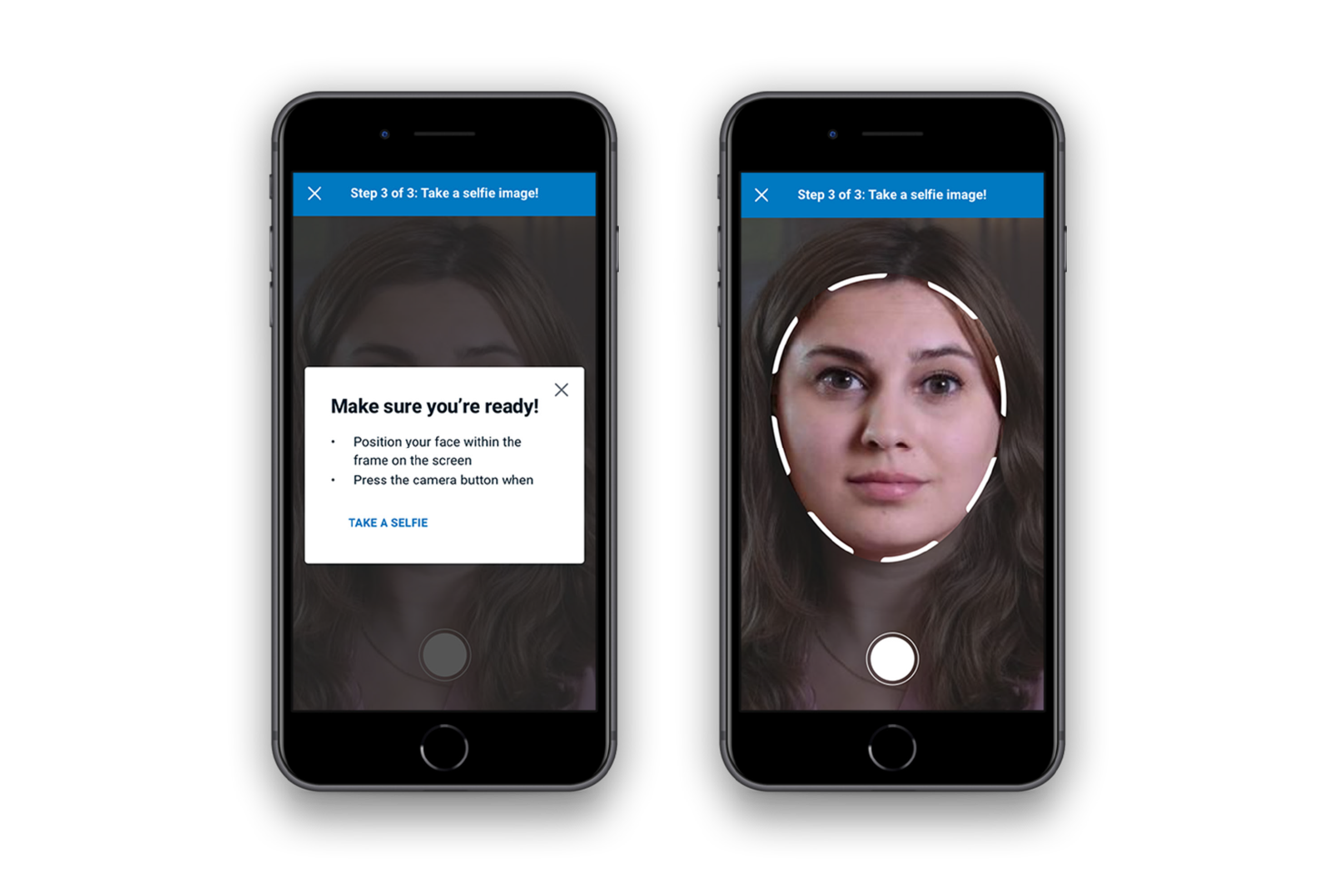
My team and I created a solution that would allow customers to scan their ID and prefill the application. The objective was to shorten the completion time of an online application for a chequing and savings account to around 90 seconds, with the secondary effect of having verified proof of identity attached to the application. It was projected that this could decrease customer dependency on branches by 7%.
When COVID-19 hit in 2020, it highlighted this major gap in the customer experience. The 60% of users whose ID could not be verified digitally needed a way to activate their accounts remotely. The 60% needed to be closer to 0% asap.
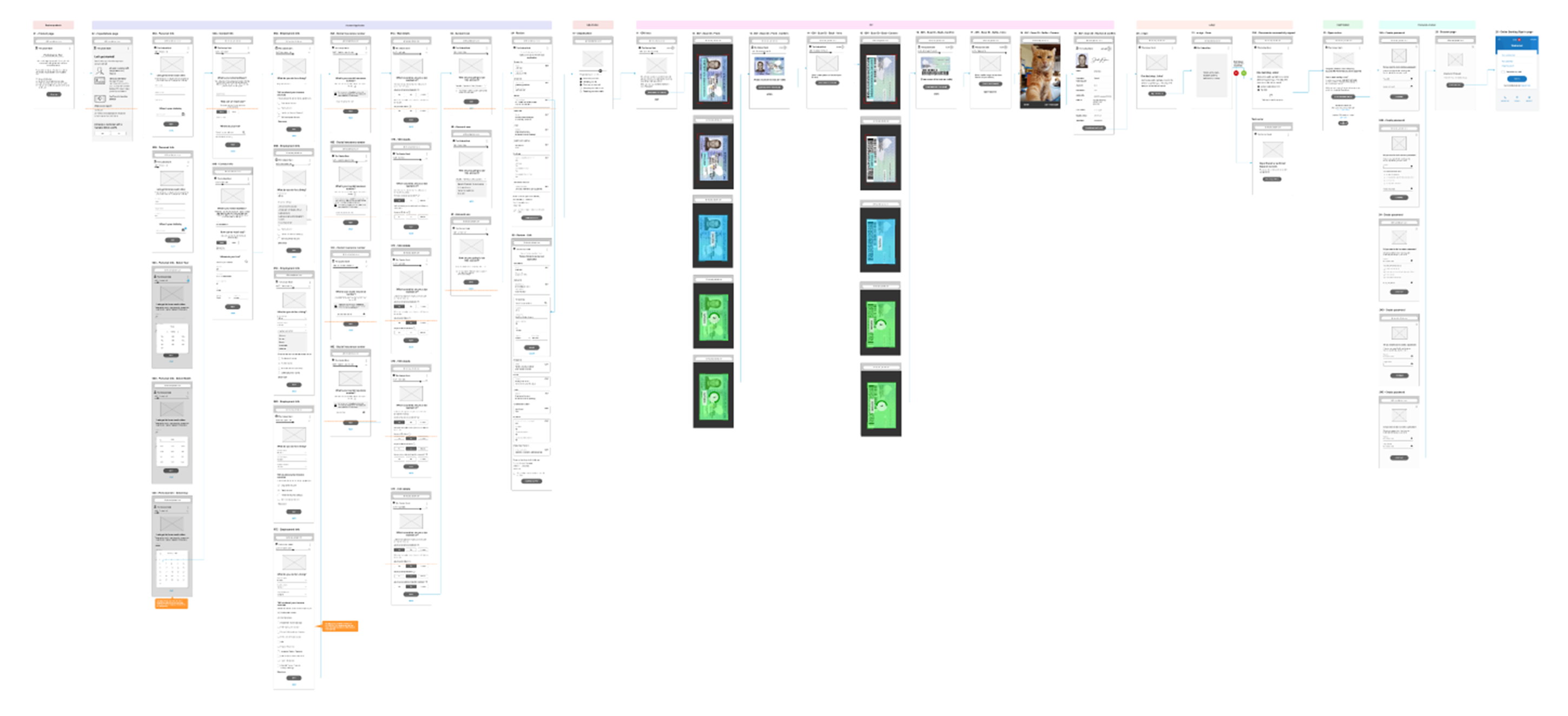
It was important for there to be as little disruption to the user flow as possible. Considering that ~40% of users would not need further validation of their ID, it made the most sense to add this change near the end of the flow, if the user needed it.

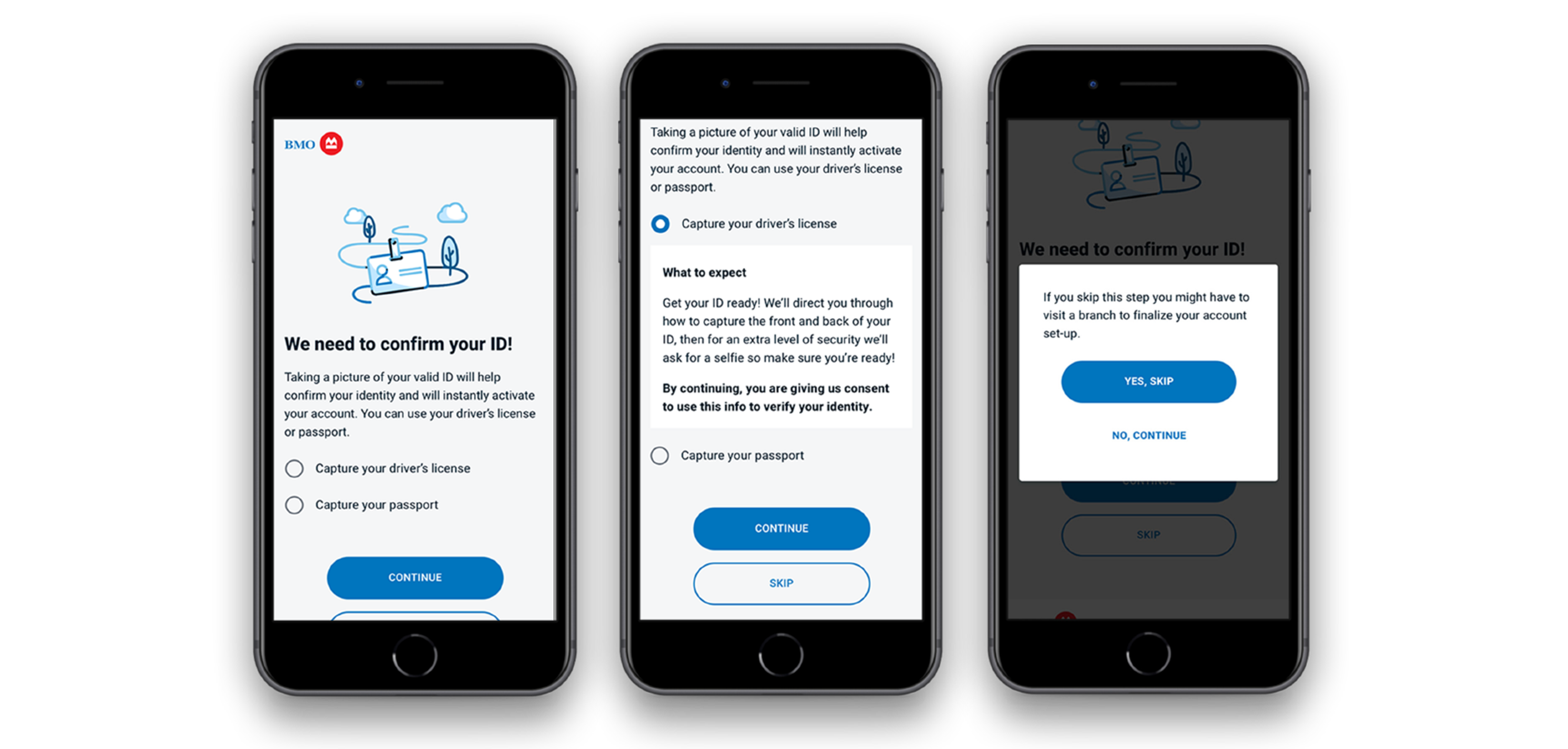
Even though this solution can save a user a trip to a branch, it still poses a potential friction point/extra step for a user. So, it was imperative to be clear that we needed to validate their ID.
The decision was made to make this step look like just another step in the application process to provide the user with cognitive association.
Users can also skip this step if they don’t want to complete it, and are prompted with the appropriate messaging so they know what skipping the step means.

