The Plan
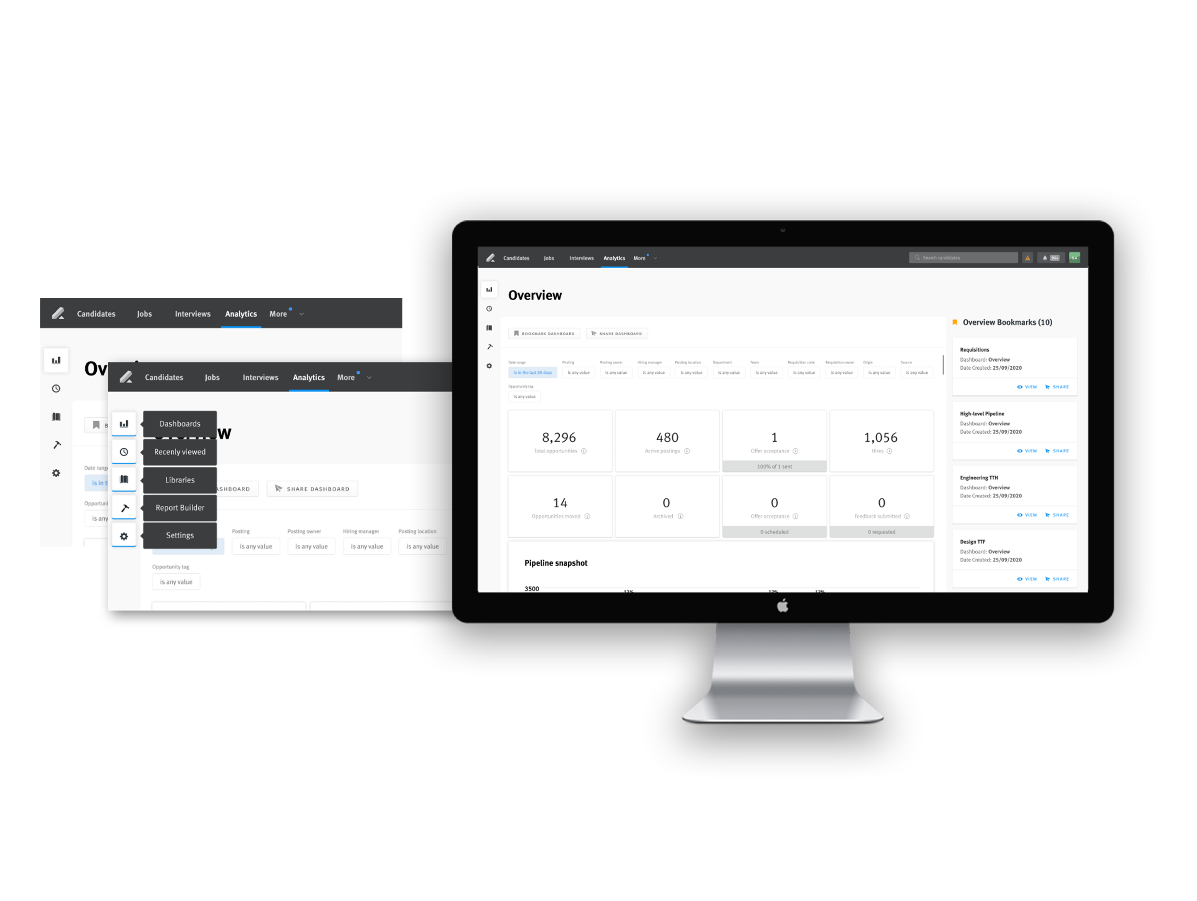
Providing recruiters with data visualization
As data increasingly becomes a staple of many organizations, they must have access to clear and accurate information as well as actionable insights so that leaders can make informed decisions when deciding on targets and metrics. In the recruiting space, data is integral to providing a quality candidate experience, as it can:
- Show how much time a candidate is spending in each stage in the pipeline.
- Inform teams on how they are doing with DE&I.
- Surface gaps and drop-off points for candidates in the pipeline.
With this in mind, when it came to re-designing the existing reporting app, I had a few key objectives that acted as the north star.
Objectives
An infrequent user of Lever. They only log in to Lever to look at data. They have a busy schedule and are pressed for time to do their work. Once they begin a task, they are laser-focused, ignoring and dismissing all outside distractions that aren’t relevant to the task at hand.
- Improve overall usability of the reporting app through clear IA.
- Ensure the visual design and UX logic are scalable (so that we can add new features seamlessly).
- Improve accessibility in data visualization.
- Increase adoption of Visual Insights (general reporting) by 20%.
- Improve data accuracy and speed.
Understanding the audience
Lever launched Visual Insights to update their reporting feature. The original reporting suite was created based on the needs of about a dozen users. With this project, I intended first to validate if those initial personas were still relevant and then, if necessary, simplify those personas and categorize them into three groups.
The data analyst
An infrequent user of Lever. They only log in to Lever to look at data. They have a busy schedule and are pressed for time to do their work. Once they begin a task, they are laser-focused, ignoring and dismissing all outside distractions that aren’t relevant to the task at hand.
The recruiter
The recruiter lives and breathes Lever. They are logging in regularly to source candidates, nurture relationships with them, move candidates through the pipeline, and fill roles, among other things. They are swamped and spend much of their time in Lever, bouncing between the candidates, interviews, and analytics pages. They are highly adaptable individuals, but may not have time to explore the product in depth.
The admin
They manage Lever for their team. They generally only log in to Lever when they need to set something up or make system changes.

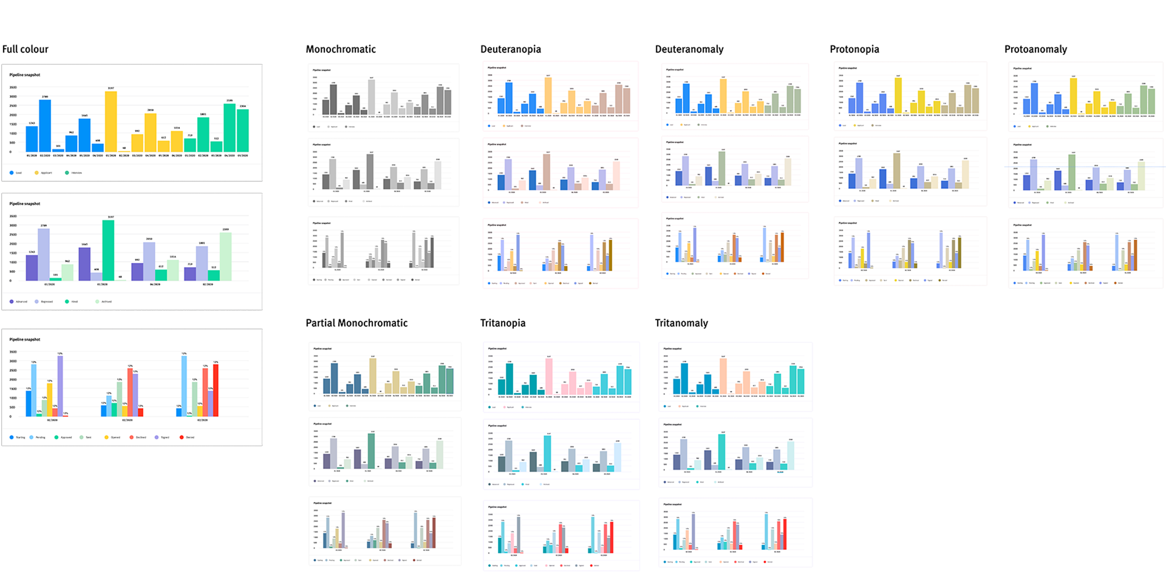
Accessible by design
Because of the importance of data, it was paramount that the way the data was visualized and consumed was accessible. I created a colour palette that was large enough to use with complex datasets, yet flexible enough to be applied in an accessible way.
Ensuring a perceptually accessible colour palette